|
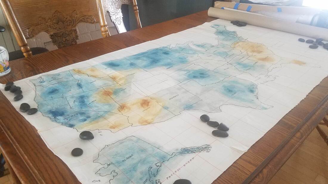
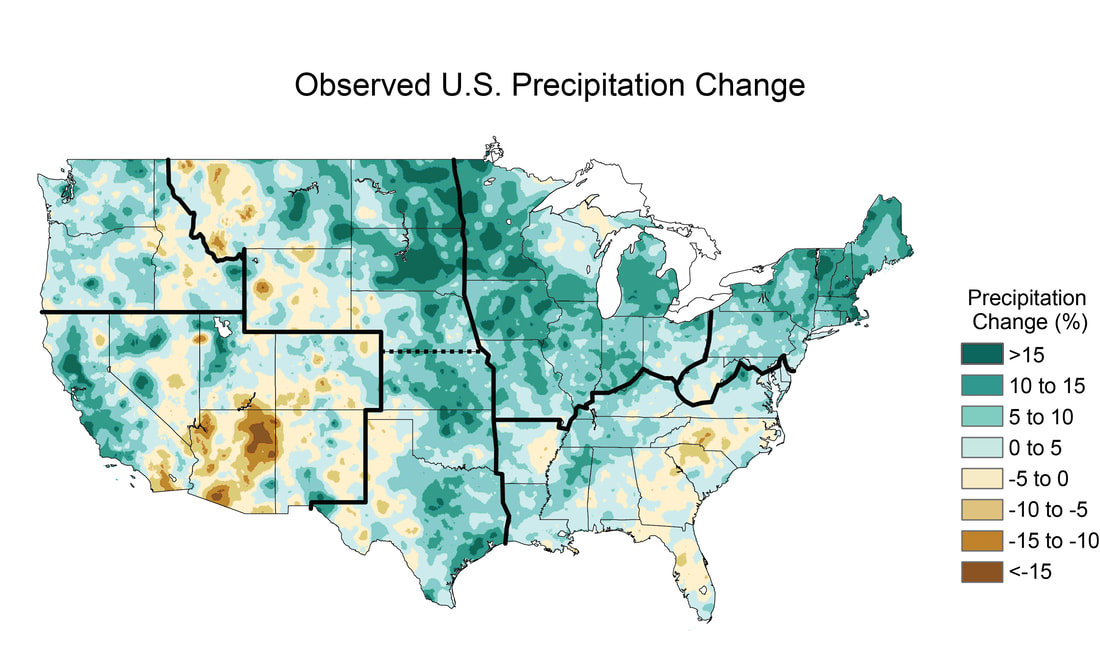
Karey It’s hard to believe that this is the last blog post of my Sci-Art Bridge Residency. I want to thank the SciArt Initiative for connecting me with Innisfree and for creating the structure within which we were able to have a lot of great conversations about maps. We covered a lot of territory! These past four months we discussed: who is the “authority” when making maps; the elements that make up a map; maps as art; map artists; art materials; climate change; deep time; geology; the Anthropocene; poetry; map-poems; maps of our neighborhoods; and the idea of counter-mapping traditional Western maps. Although we’ve come to the end of the Bridge Residency, our work together isn’t over. A few weeks ago, we started working on a collaborative climate change map of the United States. I traced a Rand McNally map of the United States onto Hanji paper, glued it together and mailed it to Innisfree (see blog post Week 13). She then worked on it and mailed it back to me. Unfortunately, it hasn’t arrived yet. Here is a picture of the colors Innisfree added to the map of the United States that I started: Innisfree was inspired by the colors used in this map of the observed U.S. Precipitation change from 1991-2012: Innisfree also has computer based mapping ideas that she would like us to pursue together. And, we might create a curriculum for teaching about maps and art - both for her GIS students and for workshops I teach. At some point we might even write a paper together. So, the collaboration continues even as the residency ends. Innisfree This experience has been so interesting and yet challenging in ways I didn’t expect. In the past few weeks I was particularly challenged in moving forward with an artistic collaboration with Karey. Last week Karey and I again had some interesting discussions. When the collaboration started we discussed the idea of how to produce something that looks like watercolor using the computer, but I was hesitant because I felt like just producing something that mimicked Karey’s painting style wouldn’t really reflect why see paints in the way she does. Finally, after 15 weeks, I feel I’m starting to have a feel for the elements of abstract painting in a deeper way. At the start I was missing several elements that are ultimately key to the type of work that Karey does: words, whitespace, and uncertainty. In traditional cartography the goal is to communicate certainty and clarity and Karey’s use of abstract symbols, words, and playing with whitespace (mixtures of figure/ground) is very different. I now have some ideas for how something similar could be done using a computer but have been struggling with developing a process that will produce pieces in a similar mode. I’m surprised because this isn’t at all where I was expecting this residency to go. What I’m particularly interested in is producing maps or images that are abstract and disorienting (or produce questioning/uncertainty). This week I discovered a new artist, Tom Hegen, a photographer who works with drone imagery to produce semi-abstract aerial images with a strong focus on shapes and patterns, producing images that are sometimes disorienting. Last week I took a risk and decided to use watercolor on the map. In traditional cartography, there are “rules” for how to use color in a map based on what you are trying to communicate. In this case, I decided to use a map of climate abnormalities from NASA as the basis for my painting. The map shows areas of above and below average precipitation. We know that climate change is producing both flooding and drought. Remembering that climate change doesn’t just mean a change in temperature, but also a change in the patterns of weather is key. In terms of color, because the range of values we are showing is above and below an average, I chose a divergent color scheme - orange/teal, similar to NASA’s map. Depending on the type of data you are working with, different types of color schemes would be appropriate. If you want to experiment with color schemes for mapping, you can play on the website Color Brewer. When your goal is to show variations around an average, a divergent scheme, using contrasting colors is considered ideal. The areas with the most extreme values, diverging from the norm, would be represented by the darkest/brightest hues and the values closest to the norm become lighter and lighter, with the average shown in white or near white. I want to thank Karey for all the fascinating discussions and SciArt for facilitating this residency and bringing us together. I hope we will be able to continue since it feels like the work is just developing.
0 Comments
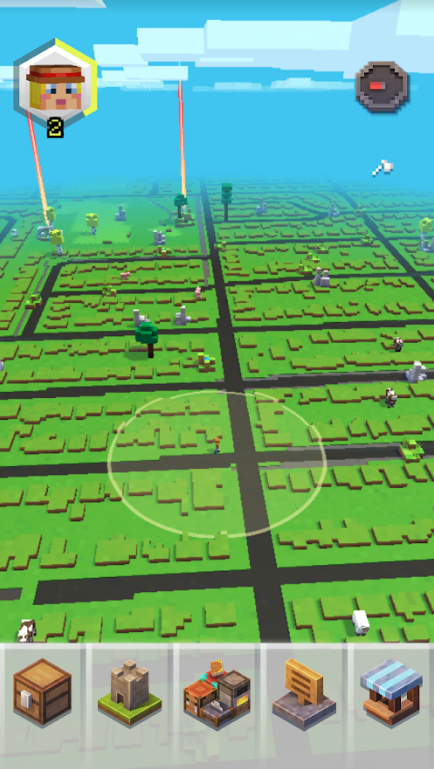
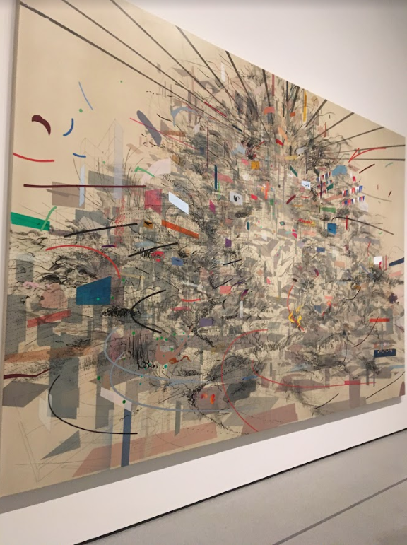
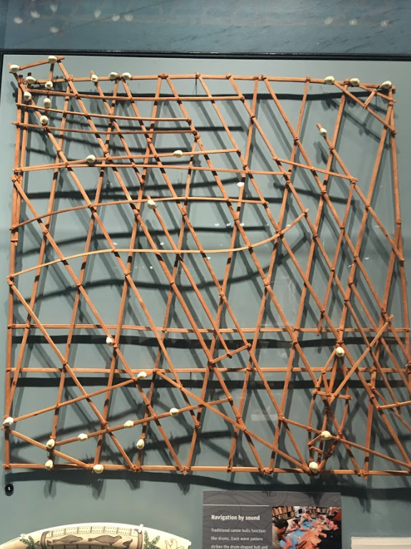
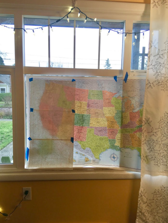
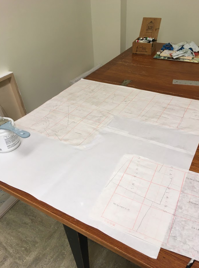
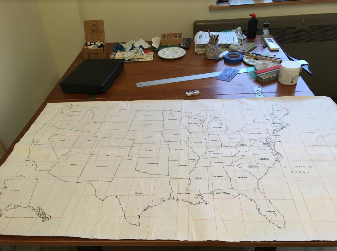
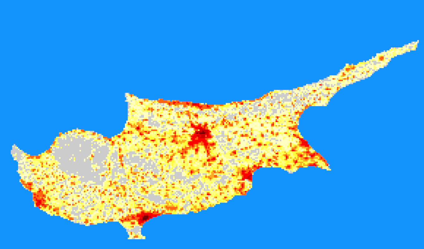
Karey I want to share four map related experiences I had during winter break. 1. My sons played a game they discovered last month: Minecraft Earth. Players use a cell phone map to navigate a place, collecting Minecraft resources that appear and then place them in an augmented reality map. As I watched them play, I was intrigued by the map itself — it looked like Minecraft (everything was made of blocks) but it was clear that it was our neighborhood: 2. I visited the newly re-designed MoMA in New York City and stumbled upon a Julie Mehretu painting. Her map art still inspires and astonishes me: 3. My kids and I went to the newly opened Burke Museum in Seattle and we saw a navagational map that shows the Marshall Islands (as shells) and “the unique wave patterns that reverberate off each island” (as wood). I had seen pictures of these navigational maps but this was the first wave-piloting map I’ve seen in person: 4. I re-read “MAP” a poem by Wislawa Szymborska. I included this poem in my fourth blog post but want to re-post it today. Szymborska’s vision of a simple green and blue map of earth is reassuring to me as we welcome in 2020. Perhaps, if we zoom out and see only the mountains, rivers, lakes, and seas and not wars, boundaries, and borders we can focus instead on our connected humanity. MAP Karey With a month to go of our SciArt residency and a lot of great conversations about maps and abstract art behind us, Innisfree and I are going to try a collaborative art work. We decided on a double trade: we’ll each start something and then send it to each other in the mail. My idea is to create a “map-poem,”, or, perhaps, a “counter-map” of the United States. It might focus on climate change but we haven’t committed to that yet. Innisfree’s idea is to create something on the computer and then send it to me. She told me she has access to a printer at the school where she teaches that can print things up to 36" wide. I’m really looking forward to receiving whatever she sends me and then figuring out how to work on it. In the meantime, I started on the “map-poem” of the United States. I took a big, classic Rand McNally map of the United States of America that was hanging on my bedroom wall, and, since I don’t have a light box, I taped it up to my front window and traced it onto Chinese calligraphy paper. I used the same paper for my “Climate Change Is Real” world map because I like the way the red lines of the calligraphy paper immediately take the map to a new place. Then, I brought the pieces of paper to my studio and glued them together: After the glue dried, I re-traced the map with a pen. I thought about adding watercolor but decided this was a good stopping point: Finally, I brought it to FedEx and shipped it to Innisfree. Now, she can draw, write, or paint on it and then ship it back to me to work on again. This whole process reminds me of CoDraw Seattle. Over the past three years I have had the honor of collaborating with an incredibly talented group of artists on co-operative drawings. We each work on a drawing and then pass it along to another artist in the group. The process is open and experimental: marks are covered up, scraped away, collaged over. I’ve learned a lot about letting go of attachment to my own work and watching the surprising additions the other artists make to my work. I’m looking forward to using a similar collaborative process with Innisfree. Innisfree Last week Karey and I talked about patterns and the ways that her work both calls on the imagery of maps and blurs the boundaries of cartographic representation and abstract art. Discussing what the lines and shapes in her work could represent or what kinds of real world objects they remind me of made me reflect on the ways that my students, who are learning geographic information systems (GIS) make connections or not between visuals that the computer program displays and real world objects or qualities. Vector-based data layers: points, lines, and polygons, can be easier to interpret. In a GIS program, they tend to represent discrete objects: a tree, a road, or a house. What seems to be more difficult to visually interpret are raster-based data layers. Raster data sets are grids were each grid square represents a single value, for example a satellite image of a portion of the earth is a raster dataset. Each pixel in that image represents the light reflecting off that little spot and being picked up by the camera on the satellite. The image below, But raster data sets can capture things that aren’t colors of light reflecting, basically any quality can be represented as a grid. For example, the image below shows human population on the Island of Cyprus, created by the U.S. Department of Energy. Brighter colors represent a higher number of people. Each grid square actually contains a number, but the number is represented by a color on the computer screen. So this week I have been working on creating and collecting some common types of raster datasets related to the landscape and topography in Seattle. Some of these are easy to understand visually, some less so. I haven’t fully completed compiling them and writing out what each represents but I wanted to create something that Karey could explore, reflecting the landscape of Seattle in different ways. Karey Last week, Innisfree shared an article with me from emergence magazine titled, Counter Mapping, by Adam Loften & Emmanuel Vaughan-Lee. It’s about Jim Enote, a Zuni farmer who is also the director of the A:shiwi A:wan Museum and Heritage Center in New Mexico. He started a mapping project with Zuni artists to create maps of the Zuni land that offer counter-narratives to the more conventional Western maps of the area. The mapping project stems from the realization that: modern maps hold no memory of what the land was before. Few of us have thought to ask what truths a map may be concealing, or have paused to consider that maps do not tell us where we are from or who we are. Many of us do not know the stories of the land in the places where we live; we have not thought to look for the topography of a myth in the surrounding rivers and hills. Perhaps this is because we have forgotten how to listen to the land around us. The article goes on to state: The [Zuni] maps are in many ways an invitation: How would you map the places that live in your memory? What are the voices of the land that are forgotten, unheard? To ensure the resilience and well-being of the places where we live, we cannot assume that land is simply ours for the taking, a means to our own ends. The Zuni maps remind all of us that we, too, must take the time to deeply listen, to hear and share stories in which we and the land have equal voice. Over the past few weeks, while working with the idea of map-poems with Innisfree, I’ve been researching the land I live on in Seattle. All the maps I have been looking at are “modern” maps created in the past one hundred and fifty years from a Western perspective. Even the geologic maps that tell the deep time of the land around me leave out any element of myth or memory. I have only lived in Seattle for a little over eleven years. Being so transient, I wonder, what does it mean to be connected to the land of Seattle? And, I am not alone — most of the people currently living in Seattle moved here within the last one hundred years (thousands moved here just within the last ten years). How much do we know about the land we live on, where our food comes from, and the source of the water we drink? Also, what does it mean to be connected to the land in Seattle when most of the land itself is covered with asphalt and grass? Some of the ways my family and I have connected to the land we live on are:
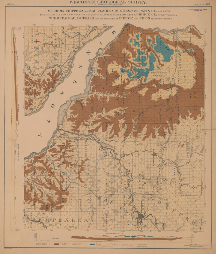
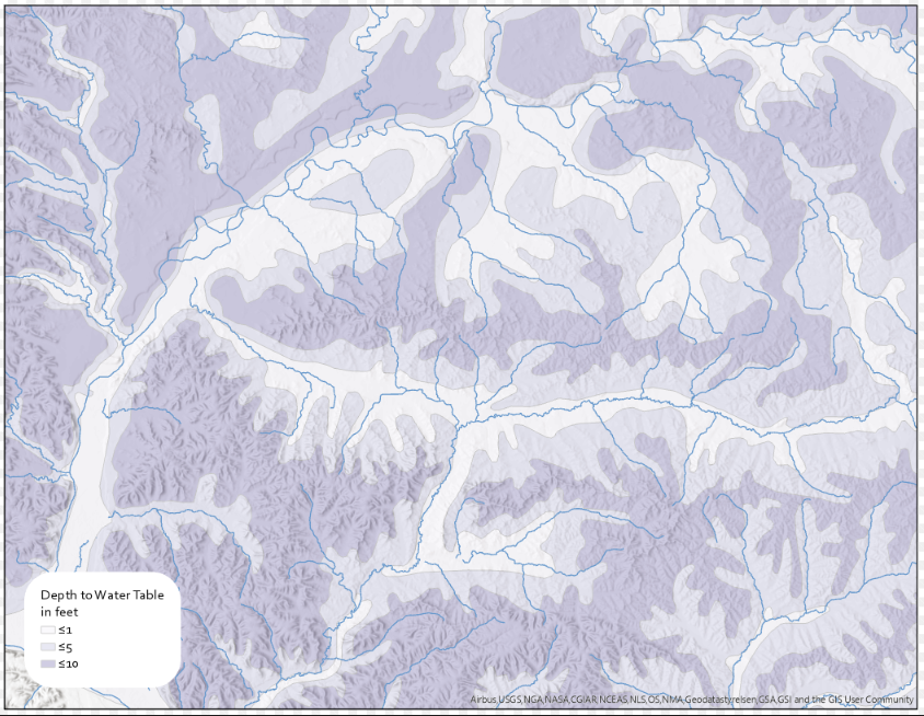
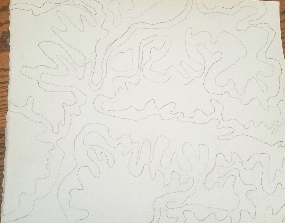
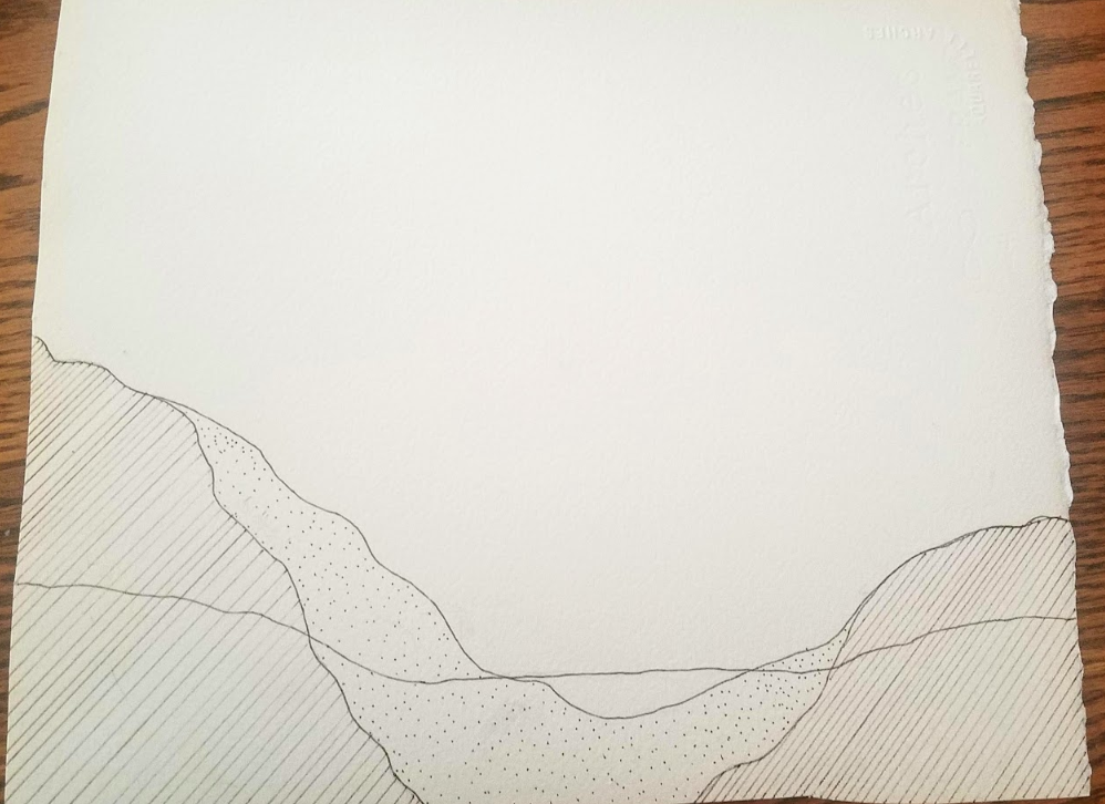
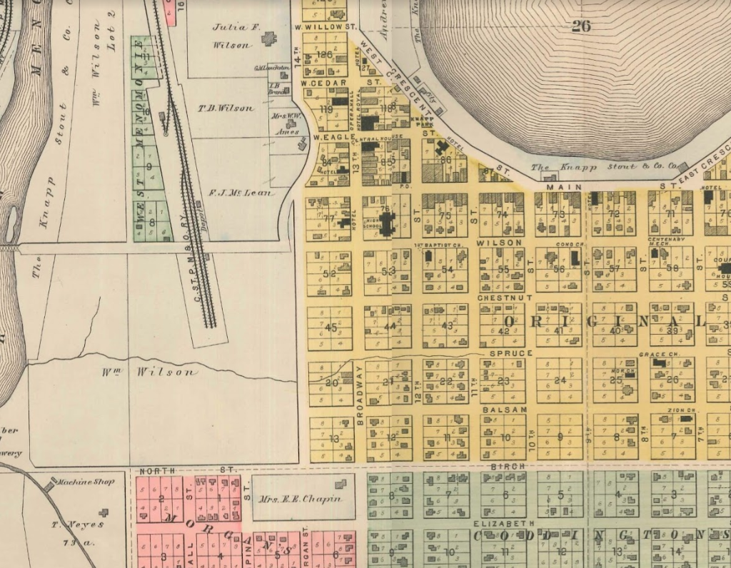
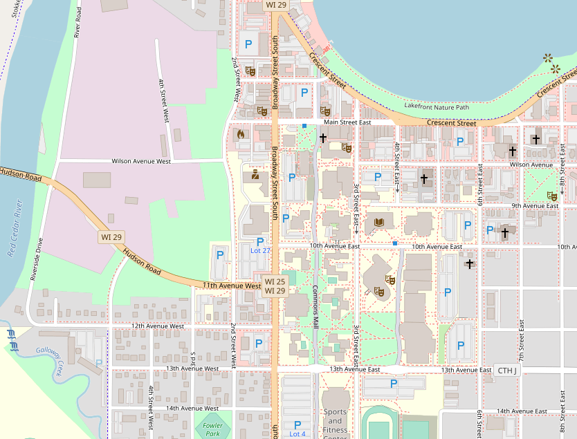
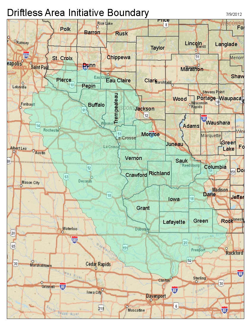
I sincerely hope that my children have a connection to Seattle that goes beyond Google Maps and the GPS maps that we use every day to get from place to place. In order to take care of this one earth we all live on, we need to start with the land beneath our feet. Karey and I had an interesting discussion this week, but I’m still struggling with the best way connect our work. She has been exploring the land histories and historical maps of Seattle. And I have been exploring historical maps of Western Wisconsin too. This week I found some exciting maps for my research from 1876 showing rock types, but also areas of prairies and wetlands. Both prairies and wetlands have largely been destroyed by agriculture over the last 150 years. Wetlands in particular have the potential to absorb pollution. I would love to be able to envision the amount of wetlands that have been lost and estimate the impact those lost wetlands could have had on water pollution. I’m also trying to take inspiration from that map and attempting again to develop some skills with the watercolors. I have also been thinking about groundwater and the patterns, in three dimensions that water flowing above and below the ground makes. Reflecting on Karey’s work made me consider the patterns and how they suggest a map while still being mostly abstract. And I think it is the types of patterns combined with the use of words to label parts of the image. So, I thought it might be helpful to focus on patterns in maps. I have been thinking about groundwater because nitrates are polluting water wells around Wisconsin. Nitrates can cause illness in young children and other people with weakened immune systems. The pollution is coming from the many dairies and livestock operations around Wisconsin, but also from leaking septic tanks produced by the large number of rural homes around the state. Particularly in areas with karst geology, contaminants can move underground as water moves. I have been exploring gis data layers related to topography, bedrock types, and groundwater. This map shows part of the Driftless shows topography, waterways, and approximate depth to the water table. You can see the map has some problems, including streams that seem to suddenly start and stop, and water table depth that only shows depth in three approximate categories. So I am starting to draw a handmade version focusing on the interesting pattern that the water table makes. I’m hoping to use a watercolor wash to better show the uncertainty of the water level. Based on the 1876 geology map, I’m also working on a hand-drawn cross section showing water and rock.
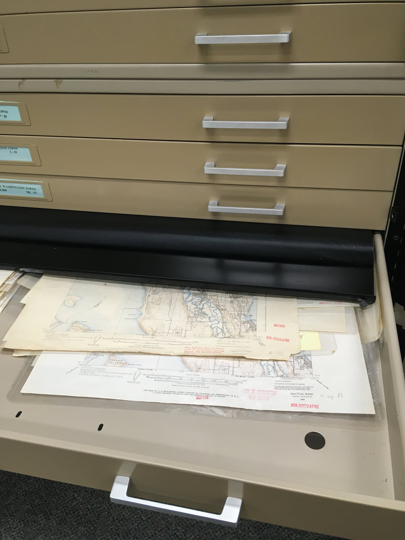
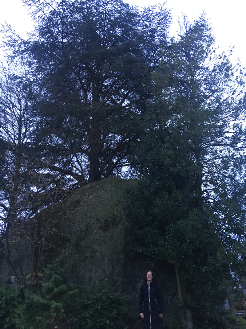
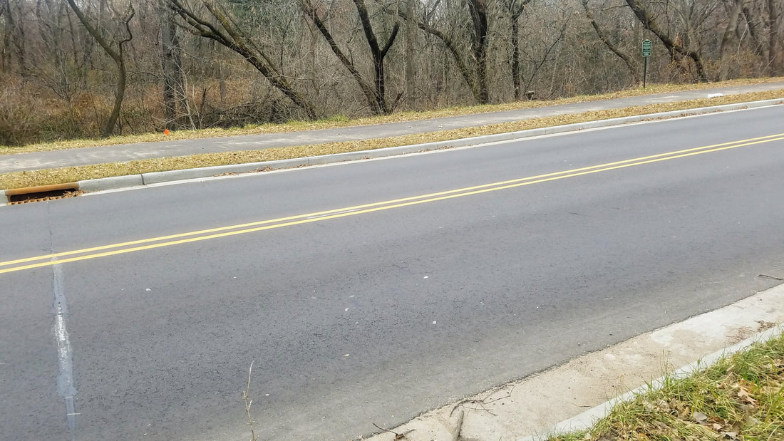
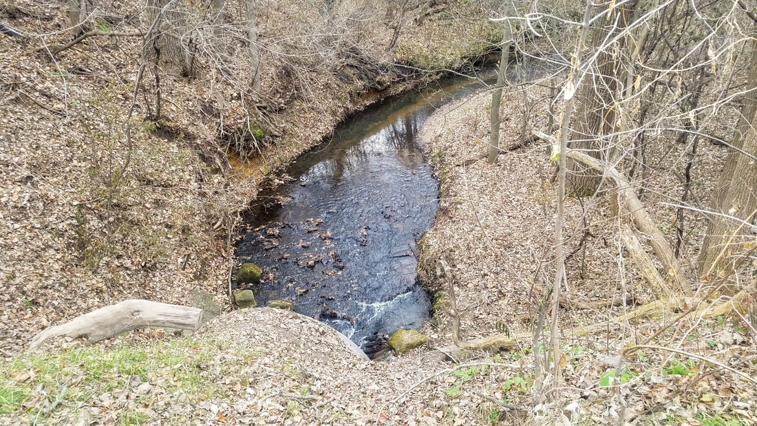
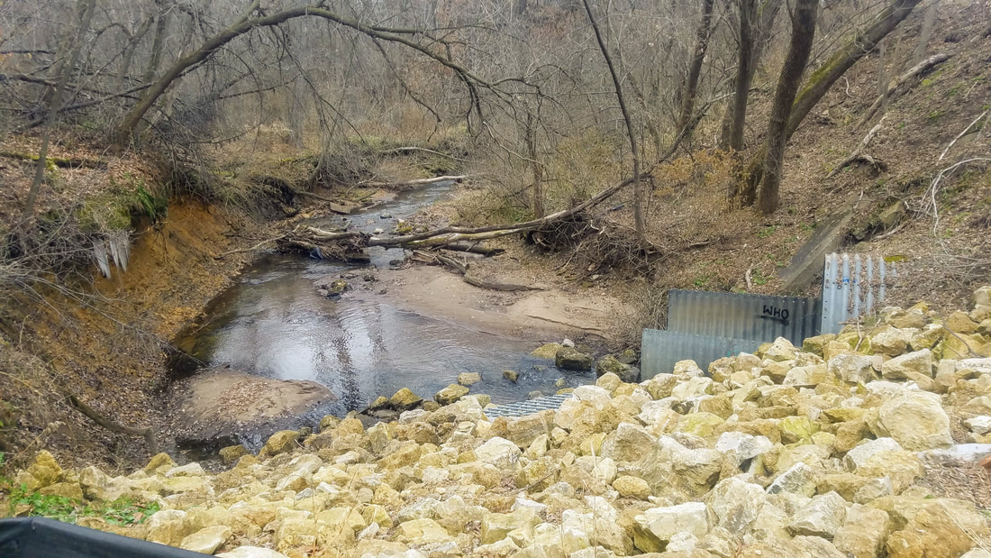
Karey This week, I’ve been thinking about deep time and how it relates to the history of my neighborhood. And, I finally made it to the map collection in the Suzzallo Library at the University of Washington. They have drawers full of maps of Seattle: I was allowed to pull the maps out and put them on a light box and trace them. Most of the maps I found were similar to the ones I looked at online last week. But then I found a map, created in 1991, of the geology of the neighborhood I live in. This map was particularly interesting to me because geologic time, deep time, humbles me. As much as I’ve been enjoying learning about the recent history of my neighborhood (1854 to the present), I’m even more interested in the impossibly huge span of geologic time - that extends back far beyond the human scale - that lives in the landscape around me. I learned that most of the land in my neighborhood is composed of Vashon till which was deposited during the Vashon Glaciation approximately 19,000 years ago. At that time, glaciers covered Seattle during the Pleistocene Ice Age. The till is composed of clay, silt, sand, cobbles and boulders. There is a huge bolder not far from my house called the “Wedgwood Rock.” It’s a glacial erratic (or rock carried by glacial ice from one area and deposited in another). According to Wikipedia, it was “a landmark for Native Americans in what was once a dense forest.” The land around the rock was left undeveloped until the mid-1940’s when it became the residential neighborhood it is today. Also, according to Wikipedia, many animals lived in Seattle and probably in my neighborhood during the Vashon Glaciation: Bison, Muskox, Grey wolves, Scimitar-toothed cat, American Lion, Saber-toothed cat, Short faced bear, Columbian mammoths, American mastodons, Jefferson’s Ground Sloths and Mazama pocket gophers. The geologic map at the library, and subsequent research into the Vashon Glaciation, reminded me how much the land around me has changed over time; how many different kinds of animals have come and gone; and how (relatively) long people have made this neighborhood home. Deep time reminds me that I am just a grain of sand in a sea of time. Innisfree This has been another busy week and I have been feeling a bit stuck on how to move forward in our collaboration, but I have managed a little exploration. One of the things I have been thinking about is the geologic history of the area where I currently live. Karey has been discussing this through the concept of deep time, which is also called geologic time. I have started to realize that this is something that I’m also exploring this concept in my own way. I have been thinking about the hydrology our watershed and how much it has been modified over the last ~150 years. My thoughts have been more about what has happened recently, but the reason I’m interested is that I believe there was something valuable here before, something that had taken many thousands of years to create. So I started looking for the creeks that are mostly covered with city buildings now. Driving through the area, I couldn’t spot any remnants of the creek closest to downtown, but traveling a bit south, I came across segments of Gilbert Creek. You can see the street and on the left-hand side of the photo, a storm drain and a long crack. I have found that this type of long crack across the road is a sign of what is happening under the road. Here is Gilbert Creek flowing into a giant culvert under the road. You can’t see the surrounding homes and apartments. If you look closely you can see the size of the sediment in the stream. Where it is flowing slowly, there is a deeper pool and fine tan sediment settled on the bottle and closer to the culvert, a shallow area with ripples and small rocks, where the water speeds up is called a riffle. And this is the creek and culvert from the other side. You can see a large amount of “rip-wrap” (the rocks place on the slope to stabilize the bank. On the left-hand side of the photo you can see were the creek has been undercutting and eroding the bank when flows are high. If you look closely, you can see the icicles that formed as water flowed out through the subsurface of the soil and down towards the stream. Further downstream you can see several large trees that have fallen into the creek as that side of the bank eroded.
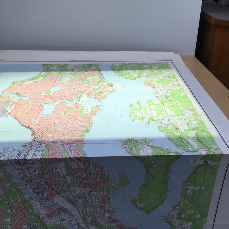
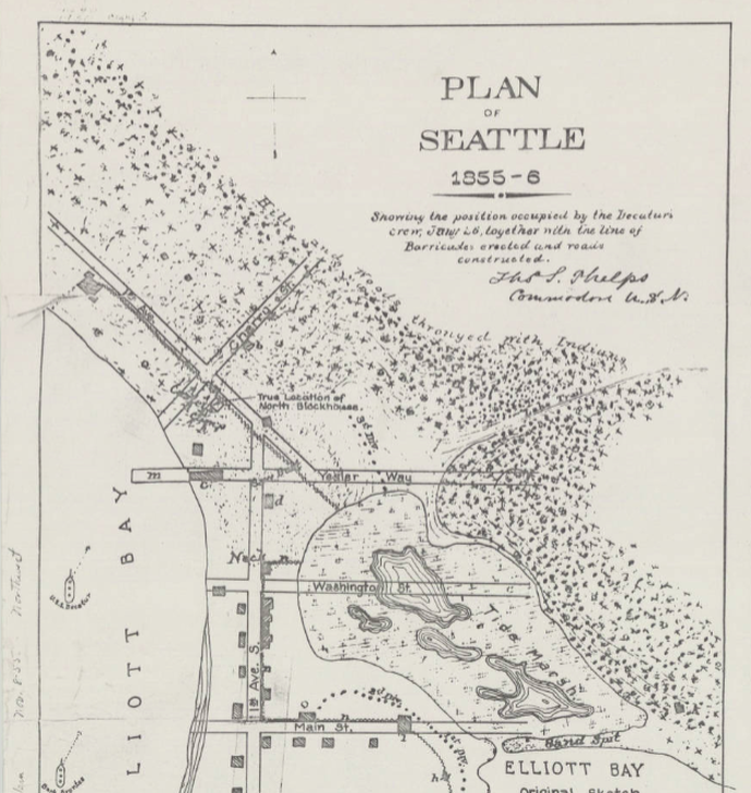
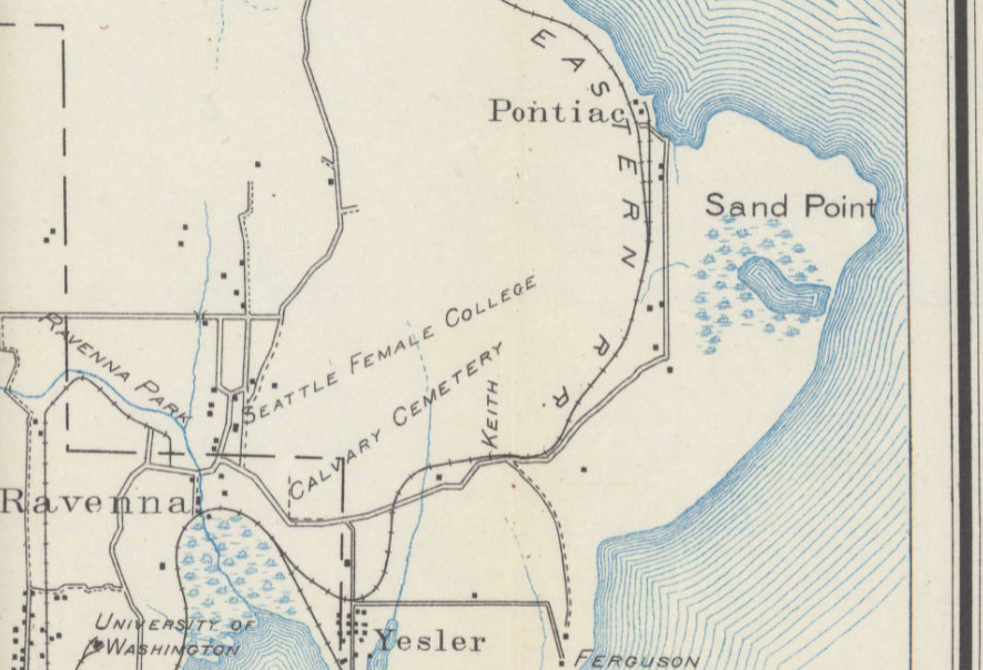
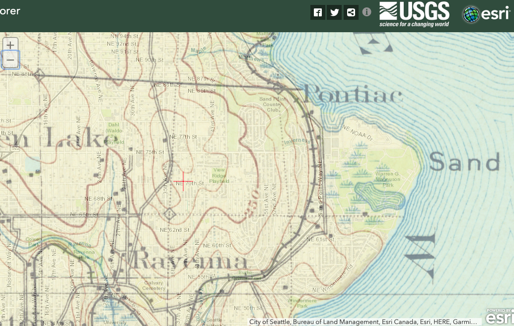
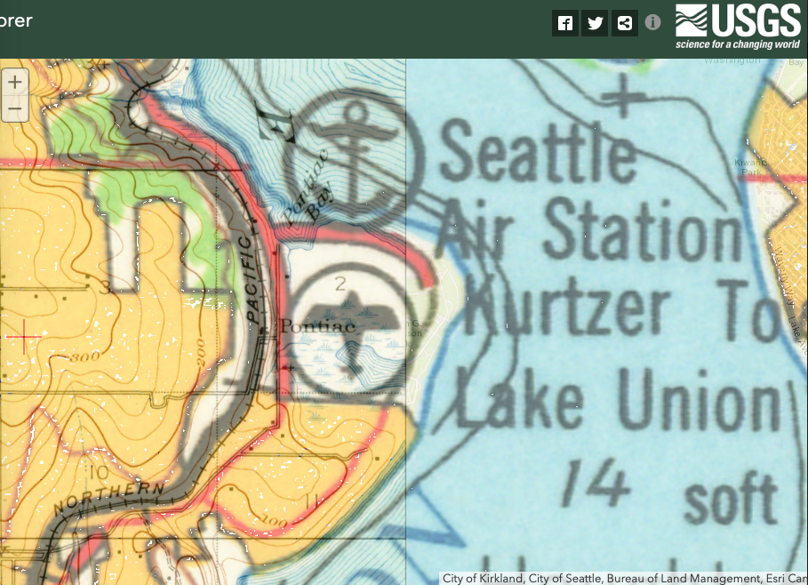
I’m narrating these photos because they look a bit ordinary. This could be any of thousands of creeks across urbanized areas of the world, but to me, there is this connection to these different time scales and the processes that formed these creeks. So when I look at these photos of this ordinary landscape, they bring up all sorts of questions and wonderings. I was just researching the basics of the geological history of Wisconsin, so I’m planning to read more about that this week. And hopefully that will spark some collaborative ideas. Karey This week, I spent time researching the history of my neighborhood. I plan to incorporate some of the information I gleaned into another map-poem. I found this wonderful website https://wedgwoodinseattlehistory.com about the history of part of the neighborhood I live in (Seattle is divided into many neighborhoods and my house touches three: Wedgwood, View Ridge and Ravenna/Bryant). This website has information and maps about the history of everything in Wedgwood: the trees, the gas stations, the schools and the streams. Most of the information is from 1954 to present day (since my neighborhood didn’t become part of Seattle City Limits until 1954 and before that it was sparsely populated). In order to find more historical maps of my neighborhood, I decided to go to the Map Room at the Seattle Central Library (surprisingly, I had never been): The Map Room was open, but, when I spoke to the person at the circulation desk, she told me that they’ve recently moved all of the maps of Seattle to the Seattle Collection Room which contains items related to Seattle’s history - including maps and atlases. Of course, the Seattle Collection Room was closed that day. So, I plan on going back later this week. I also might visit the library at the University of Washington. They have a map room and I hope to borrow a map of my neighborhood (which includes the University of Washington) to trace and add to. Innisfree informed me that Washington State University has an online digital collection of early Washington Maps. I found a few beautiful early maps of Seattle that included my neighborhood. Seattle was officially founded by colonists in 1852, but up until the early 1900’s no colonists lived in my neighborhood. The oldest map I found is this map from 1855. It shows everything north of Yesler Way (which includes my neighborhood) as “hills and woods thronged with Indians”: I was particularly drawn to this map from 1894 because of it’s depiction of the wetlands near my current art studio: Later, I was thrilled to discover that on the USGS Historical Topographical Map Explorer you can find specific locations (like my neighborhood), and then, using transparency sliders, overlay maps. I dragged the 1894 map with it’s depiction of the wetlands on top of a current map of my neighborhood: Then, I added a map from 1962 with a drawing of an airplane and an anchor where the naval base was during WWII (right on top of the wetlands). The cool thing is that naval base has recently been returned to wetlands through restoration - so, the image of the airplane overlaid on top of the wetlands in 1894 is both historically and currently true. I’m excited about these USGS Historical map overlays and will definitely be playing around with them more - perhaps tracing them and then adding to them myself.
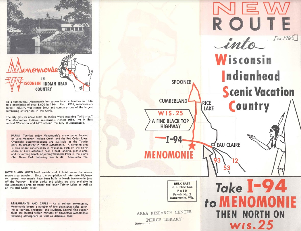
The other thing I have been researching in the history of our area is the relationship with native people. Menomonie means wild rice, and local leaders decided to call the dammed-up river next to the town Lake Menomin in a deliberate effort to evoke a certain romanticism associated with wildness and nature in order to replace the logging industry with money for the local economy related to tourism. In this brochure from 1965, you can see the way that imagery related to Native Americans is used to promote tourism and suggest the wildness or exoticism of the country while the text reassures potential visitors that the area has all the modern amenities.
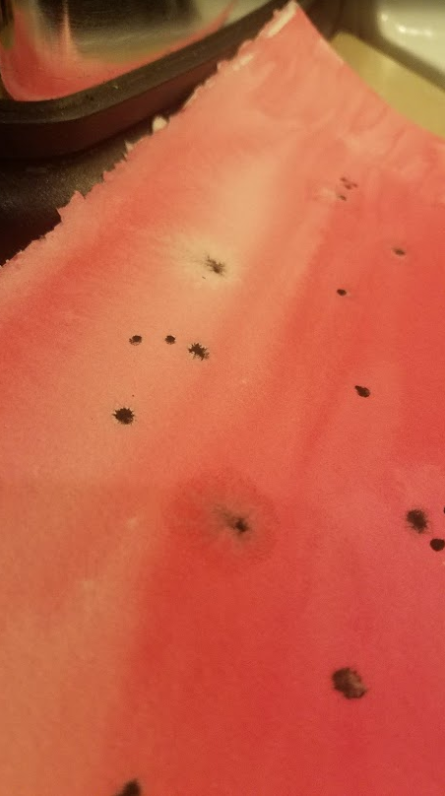
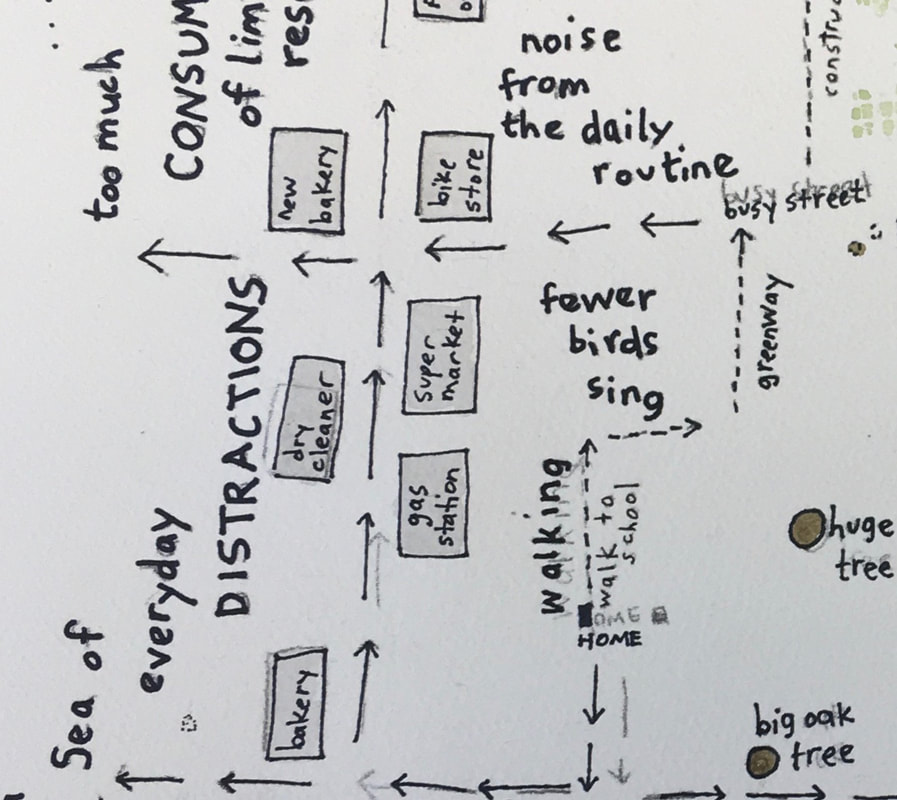
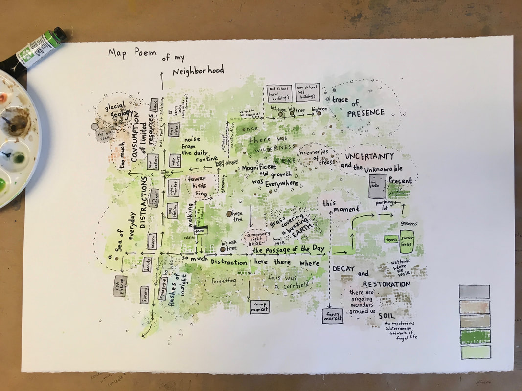
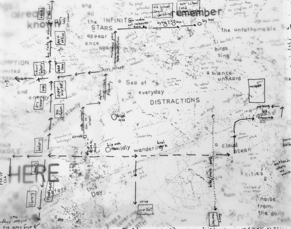
Karey I spent time this week continuing work on “map-poems” of my neighborhood. I played around with the velum maps, adding things like “magnificent old growth,” “glacial geology,” and “a sea of everyday distractions.” The 22x30 inch watercolor paper still seemed too big to work on — so, I tore it in half. Then, I traced one of my velum maps onto the watercolor paper using graphite transfer paper. I never used graphite transfer paper before and was surprised to find out, after adding permanent pen, that I couldn’t erase the graphite lines (at least not on the watercolor paper I used or with the eraser I had). So, there are a few double words and lines that I can’t get rid of. When I made the velum drawings, I thought about separating the walking marks from the driving marks by making small dotted lines for walking and arrows for driving. But, after working on the maps, I realized that I also put small dotted lines around thoughts and abstract ideas — so, in the end, I did not create a particularly clear distinction of marks. Then, when I started adding watercolor to the map, I wasn’t sure how strict I wanted to be about making particular colors represent specific places or ideas. I created a key but decided not to label the key because the colors, although partially separated by meaning, are not as distinct as they would be on most maps. The darker green represents places where there once was wilderness (but that really was everywhere); the lighter green started out as only soccer fields and tennis courts but slowly became the path of my daily routine. The grey is for buildings, the brown is mostly for soil, earth and geology, and the pink is for thoughts and ideas (although there’s also a blue-ish color that isn’t on the key that is for “flashes of insight” and “a trace of presence”). So, in the end, both my marks and colors are somewhat ambiguous. They don’t quite mean one specific thing, nor are they bound by tight boundaries and borders. Perhaps that allows for the uncertainty missing in most maps. When my son looked at this map, he was excited that he could read and understand it —but he was confused why the golf course was labeled “a trace of presence” and the area near my studio was labeled “uncertainty and the unknowable present.” I explained to him that not everything on the map related to the actual location because it’s a “map-poem”, not just a map. Being very literal, he didn’t love that answer.
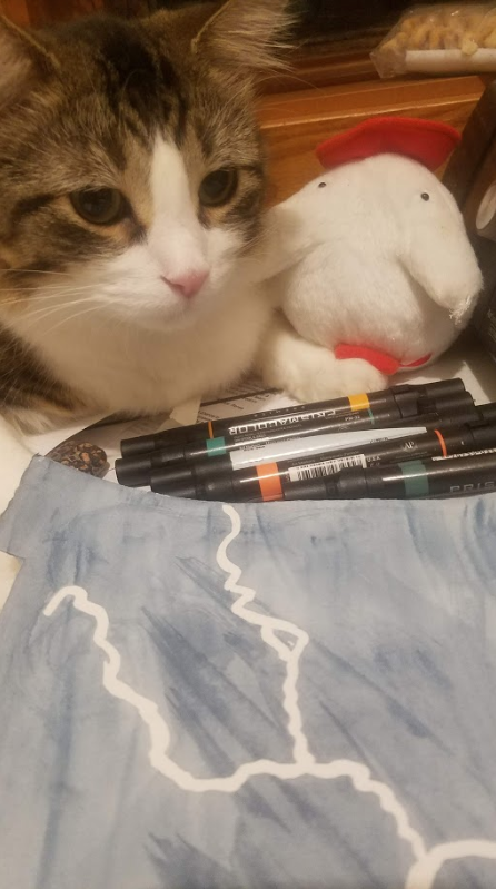
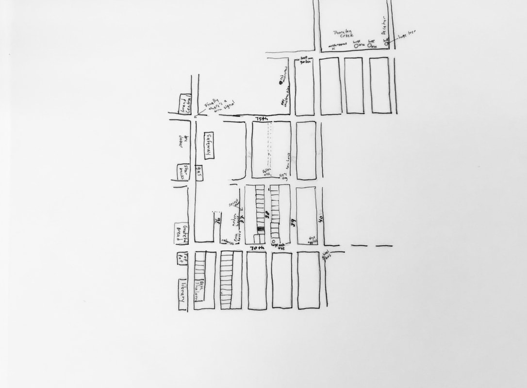
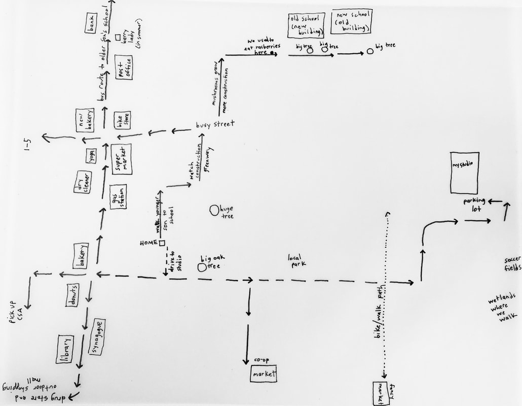
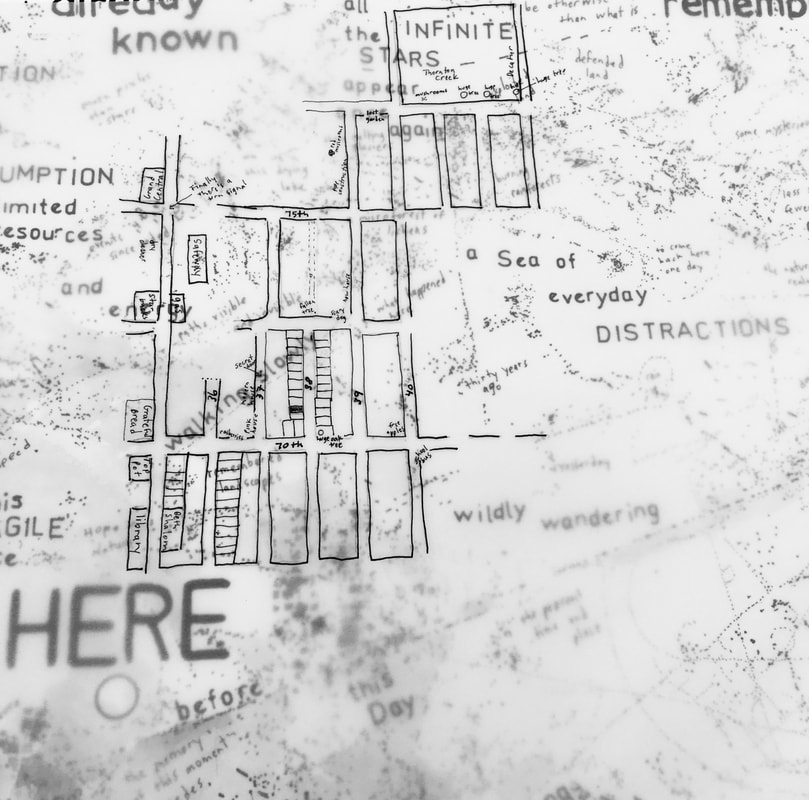
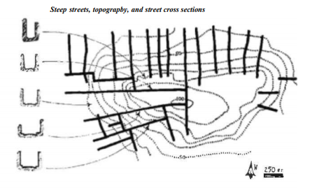
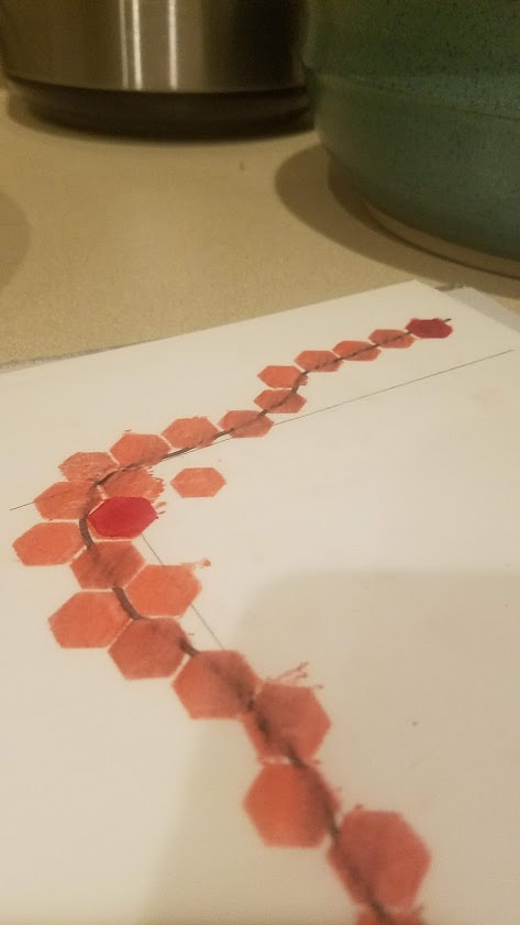
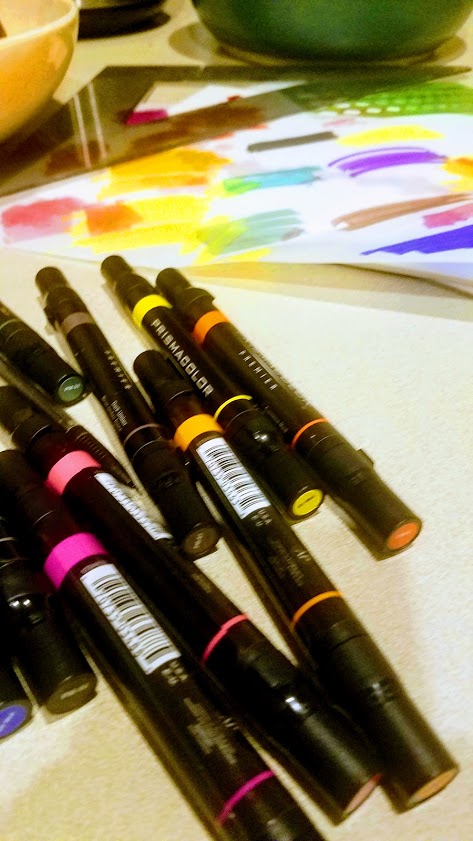
Karey I bought a piece of 22x30 inch watercolor paper and sat down to work on a “map poem” of my neighborhood and honestly, I found it quite daunting. Innisfree had mentioned using velum and pens and that sounded like a better place to start. I happened to have a pad of 11x14 inch velum paper that has been sitting around my studio but never used. So, I took out a piece of velum and traced a map of a few blocks around my house. Then, I drew in some of the places that are important to me. But, the drawing was super small and even with my .05 micron pen, I couldn’t really write much on the map. So, I decided to draw a slightly larger map of the same slice of my neighborhood, but this time without the grid and only by memory (not tracing anything). I wound up with a simplified map with only the streets and landmarks that are important to me: I wrote a few personal thoughts on the second map, but it still didn’t seem “poetic” enough - it seemed too literal. Then, I realized that since my first two neighborhood maps were drawn on velum, I could layer them on top of one of my “inscape-maps” to see how they would interact. The result was something much closer to what I envisioned a “map-poem” to be: These maps are just a beginning. I look forward to continuing work on this neighborhood map-poem project; exploring the intersection of the geographical map of my neighborhood and a more internal map of my thoughts and memories. I would also like to add text about the geography of my neighborhood and the development of the area. The land I live on was once a heavily wooded area with old growth forest, inhabited by the Duwamish tribe for thousands of years. Then, it was cleared for farming before becoming the residential neighborhood it is today. If time permits this week, I’d like to sit back down with my 22x30 inch watercolor paper and transcribe the small velum maps in some way and add more text and, perhaps, color. Innisfree This week, I have been somewhat distracted with midterms and Halloween celebrations, but Karey and I had a productive/interesting conversation. I have been continuing to struggle with the idea of abstract art and abstraction in general. But after Karey and I talked, I started feeling more comfortable. I spend so much time with my students encouraging them to be clear in their communications, to think about what they are representing. However, any cartographer is balancing simplification and representation. So this week I’m pushing simplification. This week I mentioned the work of Kevin Lynch, urban planner on the perceptual form of urban environment. Lynch wrote a lot about how we perceive our living environments. His books are filled with diagrammatic maps, which are unlabeled and often focus on the basic shapes that make up a landscape. Looking at Lynch’s drawings makes me more comfortable that drawings containing uncertainty can also be useful in communicating what a place is about. This week I have also been distracted getting involved in the #30DayMapChallenge on Twitter. The idea is to create a new map during each day of November, each with its own theme. I spent too much time this week trying out new digital mapping techniques. At the same time, I have been attempting to simplifying and consider the basic forms involved. Tonight, I attempted to combine the map challenge and the map poem exercise that Karey and I are working on. Day 4 of the map challenge involves creating a map using hexagons. In digital mapping, grouping densities using hexagons is a way to simplify the map and make sure that it draws quickly when presented over the internet. It is an abstraction, so I decided to attempt creating a hex map using hand tools. Below is my rough draft of my daily life, drawn with Prismacolor pen on vellum. I like the messiness of it. One thing I really appreciate about Karey’s work is the messiness communicates something about life that is usually missing from traditional maps. At the same time, I still want to create multiple value (light to dark) so the hexes can communicate time spent at each location.
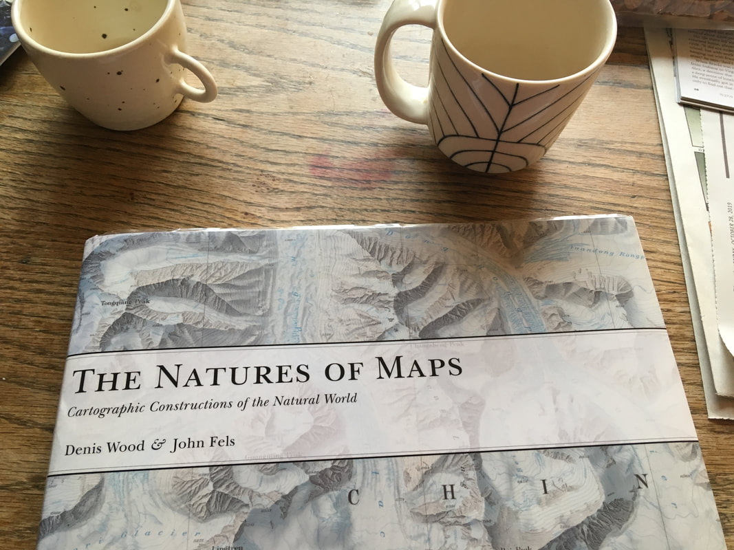
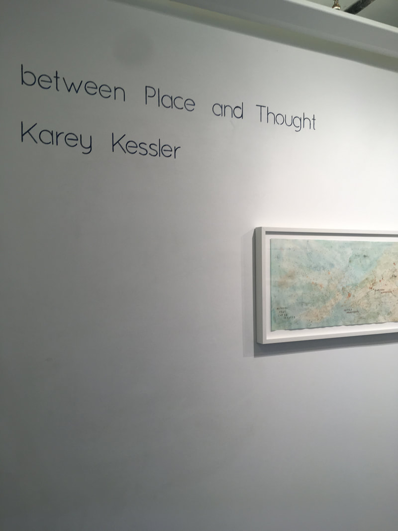
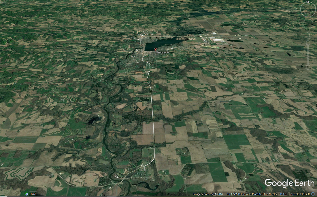
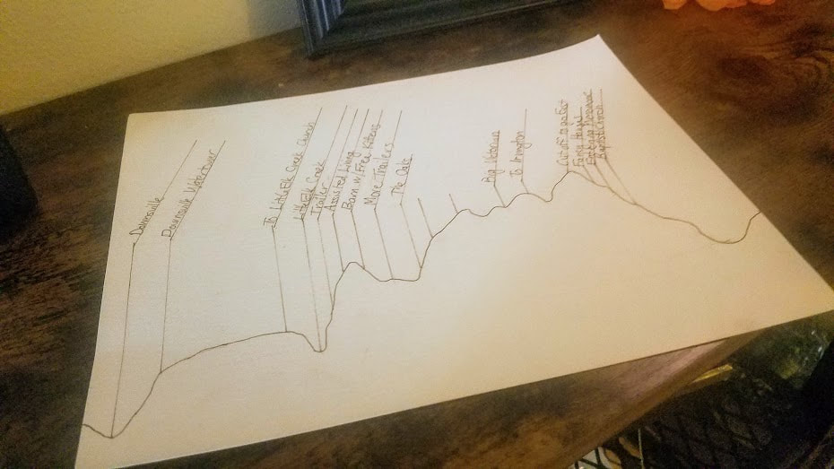
I recommend following the #30DayMapChallenge hashtag on twitter. Folks are coming up with all sorts of interesting maps and visualizations. Karey A few weeks ago, Innisfree reminded me of the writer and map enthusiast, Denis Wood. I read a few of his books when I was in graduate school and was just beginning to think about maps as a form of abstract art. Back then, Wood’s books provided me with somewhat of a bridge between real-world maps and maps as art because he, too, is interested in mapping the unmappable (or, at least mapping things that haven’t been mapped before). So, I decided to revisit Denis Wood’s writings and took out a few of his books from the library: In his book, The Natures of Maps Wood writes about maps as socially constructed arguments with subjective perspectives as opposed to being objective representations of the world. This is something Innisfree and I wrote about in our second blog posts and is one of the topics Innisfree writes about and studies in her work. Wood also writes about psychogeography, or cognitive cartographics — the geography people carry around in their heads. The idea of mental mapping is particularly interesting to me because I think of my map paintings as “mindscapes” or “inscapes.” In chapter one of The Natures of Maps Wood quotes the cognitive linguists Gilles Fauconnier and Eve Sweetser as saying: The basic idea is that, as we think and talk, mental spaces are set up, structured, and linked under pressure from grammar context and culture. The effect is to create a network of spaces through which we move as discourse unfolds. I love the mental image of moving between language and space as we think about and experience the world. Curious, I looked up “cognitive mapping” and that led me to the research of neuroscientist John O’Keefe and his Nobel prize winning work on stem cells and our experience of place. I watched this whole one-hour lecture on how your brain maps the world. He’s an excellent teacher and it was relatively easy to understand (on an artist’s level). Towards the very end of his lecture, O’Keefe talks about how both memories and our sense of place are formed in the hippocampus. This led me to muse about how I’ve been trying to paint the connection between memory and place in my maps. My show at Shift Gallery in Seattle last February was titled “between Place and Thought”: As I continued researching the connection between place and memory, I came across this article, "The tangle of space and time in human cognition," by Rafael Nunez and Kensy Cooperrider. It’s about how humans also conceptualize time in terms of space. It’s pretty dense, but I was drawn to the main idea that, “the mapping between time and space is about underlying thought, and not just surface linguistic expression” and how there is a deep neural bases for spatial and temporal conceptualization. Our experience of the “here” and the “now” is inseparable. So, with all this extremely dense scientific material in my head about our cognitive experience of “place,” “time,” and “memory,” Innisfree and I are embarking on a much more hands on artistic approach to cognitive mapping by creating map-poems of where we live. This exercise will give Innisfree the opportunity to use some of her art materials and it will give me the opportunity to map a more specific place (where I live) instead of an abstract space. We’re working on the parameters (size, materials, etc.), and hopefully we will start creating our map-poems this week. Perhaps, once we see each other’s maps we’ll trade ideas and be inspired to create more. Innisfree So, this week Karey and I agreed to start working on an exercise created by Lisa Charlotte Rost during a talk for NACIS (the North American Cartographic Information Society) in 2016 called map poetry. I discovered this exercise through another NACIS talk, Creating Space to Create: Teaching technologies you don’t know, given by Ashley Nepp at Macalester College on teaching cartographic technologies then you can’t keep up with all the new innovations yourself. This is a major problem in many scientific fields, we are inundated with data and technological innovations and it is very difficult to keep up. A first step to getting started is to get students comfortable in being “a beginner” is to get them comfortable with being vulnerable with each other, but also being willing to accept critique in the spirit of continual improvement rather than competition and the threat of failure. This week I’m struggling with being a beginner. I went to the local art supply store in our small town and asked the owner to help me pick out some arts supplies to allow me to start working on a hand made map of my experience in day to day life. I bought some brushes, paints, and paper. But, I have reverted to my reliance on the digital to get me started. Every day I drive seven miles from home to downtown Menomonie where the UW-Stout campus is. If you view the road I travel on most maps, it appears straight and boring, mostly traveling through monotonous fields of corn and soybeans. But, I actually live on the edge of what is called the Driftless Area, the one part of the Upper Midwest that wasn’t covered by glaciers during the last glacial maximum. Because of this it is hillier here, reflecting the topographic variation, hills and little valleys carved by the slow erosion of streams and rivers, that existed before the glaciers arrived to gowned down the entire region. When we moved to this area, my husband had already become sick with rheumatoid arthritis and had significant mobility issues because of joint damage and the need for a knee replacement. So I was looking for a house or apartment that was on one floor and had an attached garage so he won’t have to risk slipping on slick walkways to get to the car in winter. The place I found was in a small village seven miles from the city of Menomonie. Much of the housing in town was built prior to the widespread adoption of the automobile, so garages tend to be separate if they exist at all and most houses are multistory with bedrooms on the second floor. So I have ended up with a short commute, rather than being able to walk or bike to work. This 10-15 minute journey between the village of Downsville and the city of Menomonie features prominently in my day-to-day experience of life here. In this case, it is the vertical variation that marks the trip, so working in Google Earth, I constructed an elevation profile of my trip which I then attempted to draw. I haven’t even gotten started trying to add paints or colors to the drawing. This is just a start and rather a literal one, but at least featuring the parts of my daily trip that stand out for me. I would like to create vignettes, for various locations… I’m excited to see what Karey’s local area is like and how she perceives it.
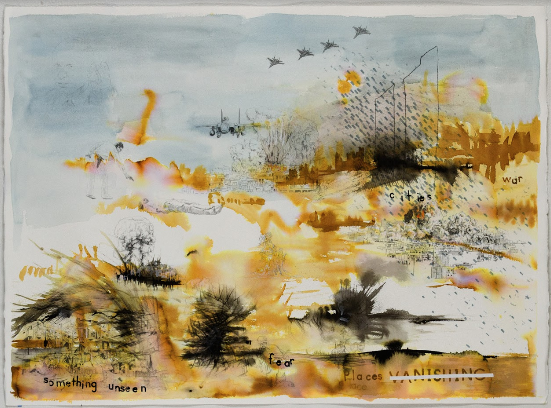
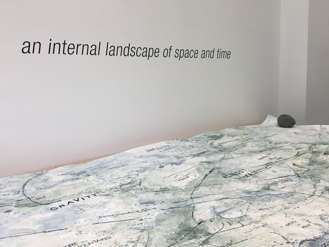
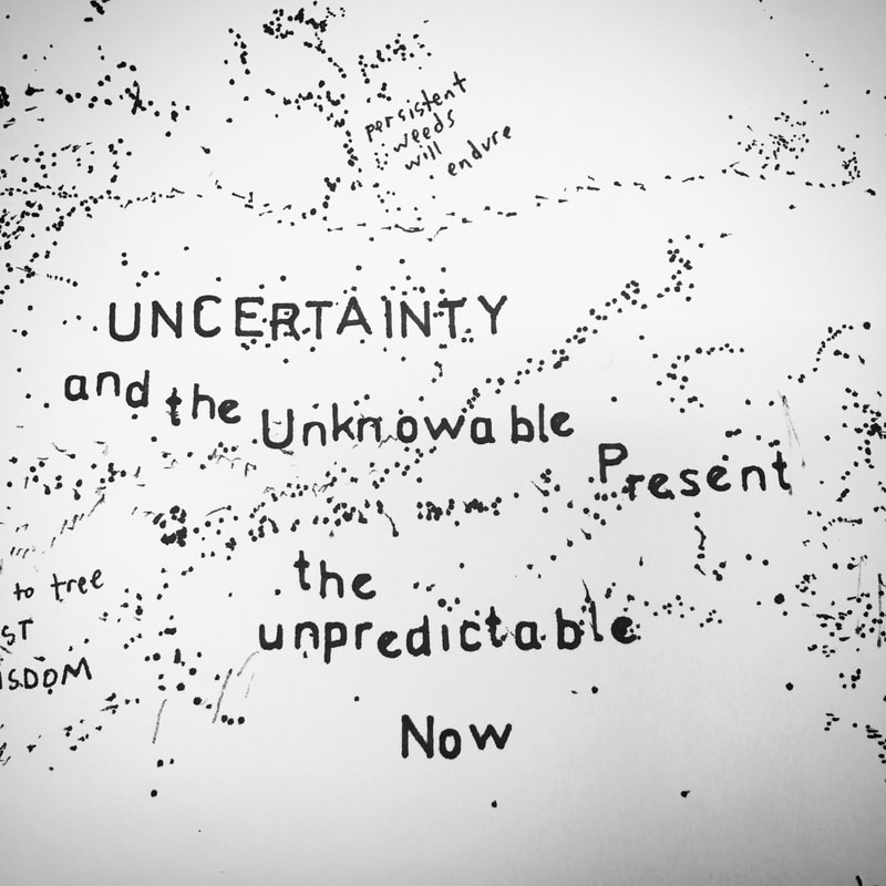
Karey Innisfree and I were unable to connect through Google Chat this week because of conflicting schedules. But, we’ve continued through texts to share our ideas about maps and abstract art and also to brainstorm ideas for possible mutual projects. I think the best (and most helpful) thing for me to write about this week is a list of some of the things we’ve been throwing around and thinking about. 1. Innisfree told me she’s particularly interested in exploring “uncertainty” and maps. We haven’t discussed what aspect of uncertainty she’s referring to, but I love the weight of the word itself and it showed up in one of my maps this week: 2. We were both musing separately about satellite and aerial images. Innisfree is interested in using them as a launching point for exploring abstract art (something I already do) and I was thinking about the question: can a photo be a map? This question and others arose from an excellent TED talk I watched about maps and Google Earth: Gopal Shah - how maps shape our world view. We live in a world that is mapped all the way from outer space right down to our front doors. We can look at 3D cities, 360-degree views of most locations, and even a photo of the cosmic view point of planet earth. Part of why I use map imagery is to counteract the hyper-mapped world we live in. To subvert our sense of knowing exactly where we are and instead asking why we are here. 3. Another thread of conversation Innisfree and I had this week was about learning more aspects of each other’s work methods. What I find intuitive and easy (thinking of map patterns as abstract and open to interpretation; using watercolor and other art materials; talking about abstract art) Innisfree finds complex and difficult. And what I find immeasurably hard (GIS, computer programs, statistical interpretation of data) Innisfree finds natural and somewhat obvious. I shared, with Innisfree, this website, maps and cartography, about map artists so she could explore a wide range of abstract artwork dealing with maps. I also plan on sharing my knowledge about different paints and pens and inks and paper so she can try creating some abstract maps on her own. And Innisfree shared a website with me about creating hill shade for hand drawn maps. She also mentioned the possibly of teaching me more about GIS/cartography principles and about sprawl patterns so that we might be able to come up with hands on projects for some of her students. 4. I am particularly excited about this list that Lisa Charlotte Rost wrote in her Map Poetry blog post that Innisfree shared with me this morning. Serendipitously, many of the terms on this list are topics I’ve been googling this week - exploring the different ways we map the world. I plan on delving more into some of these topics next week: Map Poetry = mapping weird stuff mapping less obvious stuff mapping the unexpected psychogeography Human Geography Behavioral Geography Cognitive Maps Narrative Mapping Mental Maps Emotional Cartography Creative Cartography Geographical Imaginations The Map Poetry blog post emphasized to me, what I already know: that although I use cartographic imagery, my paintings are much more like poems than maps. Real-world maps simplify places in order to be more useful for getting “from here to there” and for knowing “what’s there.” My maps purposefully create more complexity and are void of specific geographic locations - focusing instead on an ambiguous network of memories, ideas about impermanence, and the immensity of time. Innisfree The last couple of weeks have been challenging in terms of schedules and getting together with Karey. One of the interesting elements of this partnership is that while Karey and I could both make images that look like maps of the world, the purpose and method of creation are very different. So, the task has been to find areas of similarity or overlap in our practices. Karey’s post on poetry helped me to think more about representation and how there might be more areas of overlap than I initially thought. While I certainly sometimes create maps, much of my research has involved other forms of representation of places, primarily through interviews with people about a place of significance to them but also through gathering other representations of the place under contention such as media clips, maps, photographs, tourism brochures, and even art. One of my major research interests is how people go about managing their land or shared lands, and how they make decisions about these important places. Understanding why people make the decisions they do and how conflicts emerge in terms of these decisions could be key in helping us understand how to make better, more sustainable decisions in the future. In my research, I attempt to take these many different and often conflicting representations of a place and weave them together to tell some sort of consistent narrative that communicates a story of the people and processes at work. But, the reality of a place being studied isn’t one story, one narrative, it is many different processes, people, non-humans, etc, coming together to shape that place. When you attempt to summarize these and construct a single narrative, you are, simplifying, erasing, and leaving things out. In many fields there has been broad discussion of this process, of the scientist interpreting and simplifying phenomena under study, thereby missing important pieces. At the same time, the method you use to represent something being studied, also makes a difference, some things are more easily understood through a photo, or through a story or in people’s own words through a quote. I have been struggling a bit this week with the somewhat abstract elements to Karey’s art. I have been thinking, what does abstract art mean?
|

