|
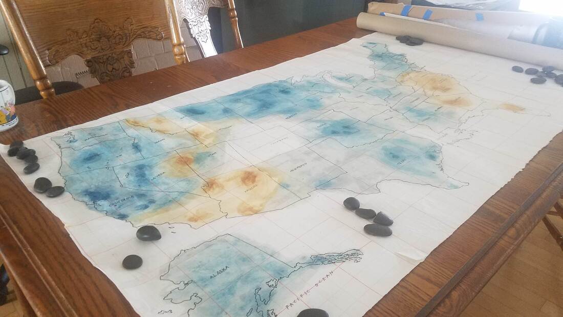
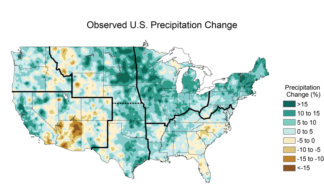
Karey It’s hard to believe that this is the last blog post of my Sci-Art Bridge Residency. I want to thank the SciArt Initiative for connecting me with Innisfree and for creating the structure within which we were able to have a lot of great conversations about maps. We covered a lot of territory! These past four months we discussed: who is the “authority” when making maps; the elements that make up a map; maps as art; map artists; art materials; climate change; deep time; geology; the Anthropocene; poetry; map-poems; maps of our neighborhoods; and the idea of counter-mapping traditional Western maps. Although we’ve come to the end of the Bridge Residency, our work together isn’t over. A few weeks ago, we started working on a collaborative climate change map of the United States. I traced a Rand McNally map of the United States onto Hanji paper, glued it together and mailed it to Innisfree (see blog post Week 13). She then worked on it and mailed it back to me. Unfortunately, it hasn’t arrived yet. Here is a picture of the colors Innisfree added to the map of the United States that I started: Innisfree was inspired by the colors used in this map of the observed U.S. Precipitation change from 1991-2012: Innisfree also has computer based mapping ideas that she would like us to pursue together. And, we might create a curriculum for teaching about maps and art - both for her GIS students and for workshops I teach. At some point we might even write a paper together. So, the collaboration continues even as the residency ends. Innisfree This experience has been so interesting and yet challenging in ways I didn’t expect. In the past few weeks I was particularly challenged in moving forward with an artistic collaboration with Karey. Last week Karey and I again had some interesting discussions. When the collaboration started we discussed the idea of how to produce something that looks like watercolor using the computer, but I was hesitant because I felt like just producing something that mimicked Karey’s painting style wouldn’t really reflect why see paints in the way she does. Finally, after 15 weeks, I feel I’m starting to have a feel for the elements of abstract painting in a deeper way. At the start I was missing several elements that are ultimately key to the type of work that Karey does: words, whitespace, and uncertainty. In traditional cartography the goal is to communicate certainty and clarity and Karey’s use of abstract symbols, words, and playing with whitespace (mixtures of figure/ground) is very different. I now have some ideas for how something similar could be done using a computer but have been struggling with developing a process that will produce pieces in a similar mode. I’m surprised because this isn’t at all where I was expecting this residency to go. What I’m particularly interested in is producing maps or images that are abstract and disorienting (or produce questioning/uncertainty). This week I discovered a new artist, Tom Hegen, a photographer who works with drone imagery to produce semi-abstract aerial images with a strong focus on shapes and patterns, producing images that are sometimes disorienting. Last week I took a risk and decided to use watercolor on the map. In traditional cartography, there are “rules” for how to use color in a map based on what you are trying to communicate. In this case, I decided to use a map of climate abnormalities from NASA as the basis for my painting. The map shows areas of above and below average precipitation. We know that climate change is producing both flooding and drought. Remembering that climate change doesn’t just mean a change in temperature, but also a change in the patterns of weather is key. In terms of color, because the range of values we are showing is above and below an average, I chose a divergent color scheme - orange/teal, similar to NASA’s map. Depending on the type of data you are working with, different types of color schemes would be appropriate. If you want to experiment with color schemes for mapping, you can play on the website Color Brewer. When your goal is to show variations around an average, a divergent scheme, using contrasting colors is considered ideal. The areas with the most extreme values, diverging from the norm, would be represented by the darkest/brightest hues and the values closest to the norm become lighter and lighter, with the average shown in white or near white. I want to thank Karey for all the fascinating discussions and SciArt for facilitating this residency and bringing us together. I hope we will be able to continue since it feels like the work is just developing.
0 Comments
Leave a Reply. |


