|
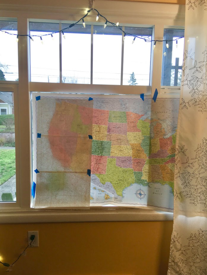
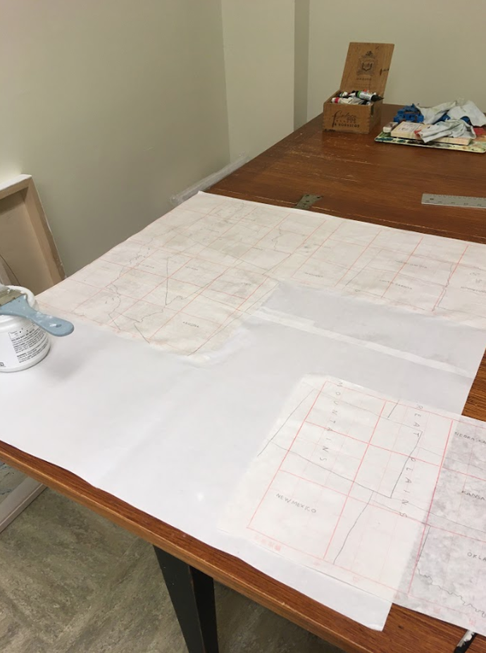
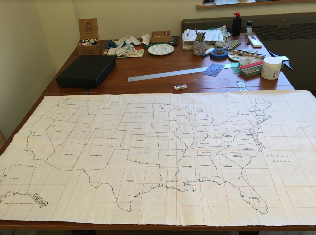
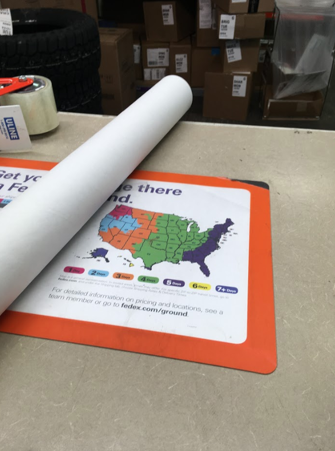
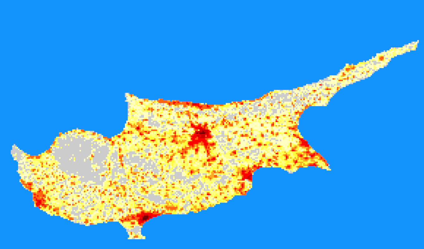
Karey With a month to go of our SciArt residency and a lot of great conversations about maps and abstract art behind us, Innisfree and I are going to try a collaborative art work. We decided on a double trade: we’ll each start something and then send it to each other in the mail. My idea is to create a “map-poem,”, or, perhaps, a “counter-map” of the United States. It might focus on climate change but we haven’t committed to that yet. Innisfree’s idea is to create something on the computer and then send it to me. She told me she has access to a printer at the school where she teaches that can print things up to 36" wide. I’m really looking forward to receiving whatever she sends me and then figuring out how to work on it. In the meantime, I started on the “map-poem” of the United States. I took a big, classic Rand McNally map of the United States of America that was hanging on my bedroom wall, and, since I don’t have a light box, I taped it up to my front window and traced it onto Chinese calligraphy paper. I used the same paper for my “Climate Change Is Real” world map because I like the way the red lines of the calligraphy paper immediately take the map to a new place. Then, I brought the pieces of paper to my studio and glued them together: After the glue dried, I re-traced the map with a pen. I thought about adding watercolor but decided this was a good stopping point: Finally, I brought it to FedEx and shipped it to Innisfree. Now, she can draw, write, or paint on it and then ship it back to me to work on again. This whole process reminds me of CoDraw Seattle. Over the past three years I have had the honor of collaborating with an incredibly talented group of artists on co-operative drawings. We each work on a drawing and then pass it along to another artist in the group. The process is open and experimental: marks are covered up, scraped away, collaged over. I’ve learned a lot about letting go of attachment to my own work and watching the surprising additions the other artists make to my work. I’m looking forward to using a similar collaborative process with Innisfree. Innisfree Last week Karey and I talked about patterns and the ways that her work both calls on the imagery of maps and blurs the boundaries of cartographic representation and abstract art. Discussing what the lines and shapes in her work could represent or what kinds of real world objects they remind me of made me reflect on the ways that my students, who are learning geographic information systems (GIS) make connections or not between visuals that the computer program displays and real world objects or qualities. Vector-based data layers: points, lines, and polygons, can be easier to interpret. In a GIS program, they tend to represent discrete objects: a tree, a road, or a house. What seems to be more difficult to visually interpret are raster-based data layers. Raster data sets are grids were each grid square represents a single value, for example a satellite image of a portion of the earth is a raster dataset. Each pixel in that image represents the light reflecting off that little spot and being picked up by the camera on the satellite. The image below, But raster data sets can capture things that aren’t colors of light reflecting, basically any quality can be represented as a grid. For example, the image below shows human population on the Island of Cyprus, created by the U.S. Department of Energy. Brighter colors represent a higher number of people. Each grid square actually contains a number, but the number is represented by a color on the computer screen. So this week I have been working on creating and collecting some common types of raster datasets related to the landscape and topography in Seattle. Some of these are easy to understand visually, some less so. I haven’t fully completed compiling them and writing out what each represents but I wanted to create something that Karey could explore, reflecting the landscape of Seattle in different ways.
0 Comments
Leave a Reply. |

