KS: You are an evolutionary biologist, designer, data analyst, and information architect. What brought you to these diverse subjects
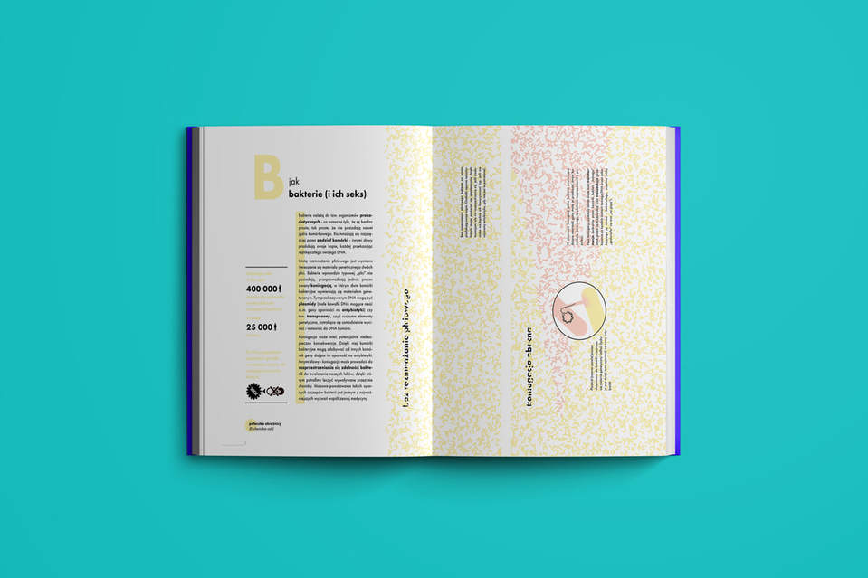
SD: Evolutionary biology was my field of research by choice - the moment I glimpsed the complexity and logic of evolutionary genetics I knew it would take over my whole life. Since that time I’ve tried to look for evolutionary patterns everywhere around me, which indirectly brought me to graphic design and information architecture. Evolutionary theory is a simple and astonishingly straightforward research program - basically evolution HAS to occur wherever its basic ingredients are present. However, it’s also very unintuitive - many of its aspects require the viewer to shift their perspective, and abandon some of the strongest habits we humans have, such as searching for purpose and some ultimate "cause”, or looking for patterns where there are none. Here enters graphic design: I notice pretty quickly that by using clever metaphors and intuitive illustrations I could reach to other people easily, converting hard-to-grasp scientific concepts into neat, eye-catching visuals that speak for themselves. I have never abandoned science - I’m still a very active biologist and I probably participate in more projects than I should (laughing). But somehow linking science and visual expression helped me by letting me present my ideas in a clear way. Actually, currently art started infiltrating my scientific work too - I’ve started a large research grant aimed at studying colouration of birds on all levels of its complexity. Could I find a more visual evolutionary study system? I doubt it!
SD: Evolutionary biology was my field of research by choice - the moment I glimpsed the complexity and logic of evolutionary genetics I knew it would take over my whole life. Since that time I’ve tried to look for evolutionary patterns everywhere around me, which indirectly brought me to graphic design and information architecture. Evolutionary theory is a simple and astonishingly straightforward research program - basically evolution HAS to occur wherever its basic ingredients are present. However, it’s also very unintuitive - many of its aspects require the viewer to shift their perspective, and abandon some of the strongest habits we humans have, such as searching for purpose and some ultimate "cause”, or looking for patterns where there are none. Here enters graphic design: I notice pretty quickly that by using clever metaphors and intuitive illustrations I could reach to other people easily, converting hard-to-grasp scientific concepts into neat, eye-catching visuals that speak for themselves. I have never abandoned science - I’m still a very active biologist and I probably participate in more projects than I should (laughing). But somehow linking science and visual expression helped me by letting me present my ideas in a clear way. Actually, currently art started infiltrating my scientific work too - I’ve started a large research grant aimed at studying colouration of birds on all levels of its complexity. Could I find a more visual evolutionary study system? I doubt it!
|
KS: How do your experiences as an evolutionary biologist inform your sciart work?
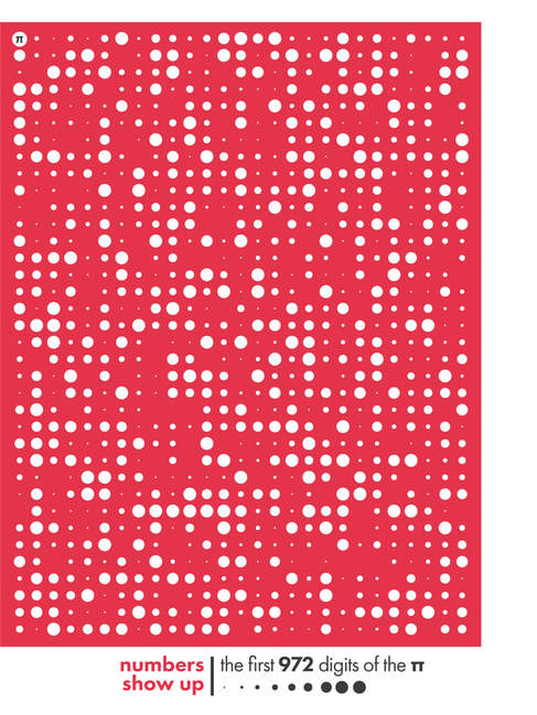
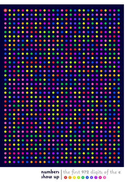
SD: Evolution is great in generating patterns from chaos - basically all evolutionary processes operate on some random, chaotic variations and turn them into directed "products”, shaped by the needs of adapting organisms. In many of my illustrations I try to follow this logic, starting with preliminary chaotic collections of numbers, and turning them into something that has some ordering and logical structure. Of course, my illustrative art is very often affected by my scientific work - recently I’ve illustrated several books and posters that presented various evolutionary concepts. This is what I like in my work the most - in my art nobody is judging me and my outputs, somehow turning them into art let’s me escape the (sometimes boring) routine of scientific review and scrutiny, of course without sacrificing scientific correctness and objectivity. KS: What is your process for turning data into eye catching informative illustrations?
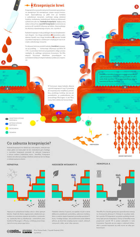
SD: I usually start with an idea, I probe my imagination and look for unusual connections or associations. For an infographic about blood clotting process, I’ve exploited directly the idea of an signal "cascade”, turning the whole coagulation process into a series of shimmering blood0-red waterfalls. Another piece of work, created as a tribute to Maria Skłodowska-Curie, a great Polish physicist and the precursor of medical physics, was designed so as to resemble the radioactive glow of radium, one of the elements discovered by Skłodowska-Curie and used in medical physics. Very often I include numbers and quantitative summaries in my illustrations - in such cases I usually generate the basic structures and scaffolds of raw data in R and Python, turn them into vector graphics, and then edit them and expand visually using Adobe Illustrator and Photoshop KS: What projects are you currently working on?
SD: Apart from a long queue of infographics waiting for the final touch (my favorite is a chart of glass-coloring elements, merged with a menagerie of polish 70-ies glass artworks) I’ve started a new project centered around science and art: a series of visual movies, guides to the interface that exists between art and science. The movies will feature the most visual aspects of chemistry, physics and biology, connected together through animations and music. I hope they will represent my view of science and art - two interconnected fields that for me are essentially unified and very hard to separate or tell apart. |
For more of Szymon's work follow him on Instagram and Twitter or visit his websites szdrobniak and szymekdrobniaken
Contact Szymon at [email protected]
Contact Szymon at [email protected]

