Christopher Arabadjis
Interview by Alexandra Constantinou, Communications & Web Intern
AC: You studied physics but many of your drawings seem to have an organic, biological feel to them. Do you see your work as strictly physics-based or do you intentionally incorporate other fields of science?
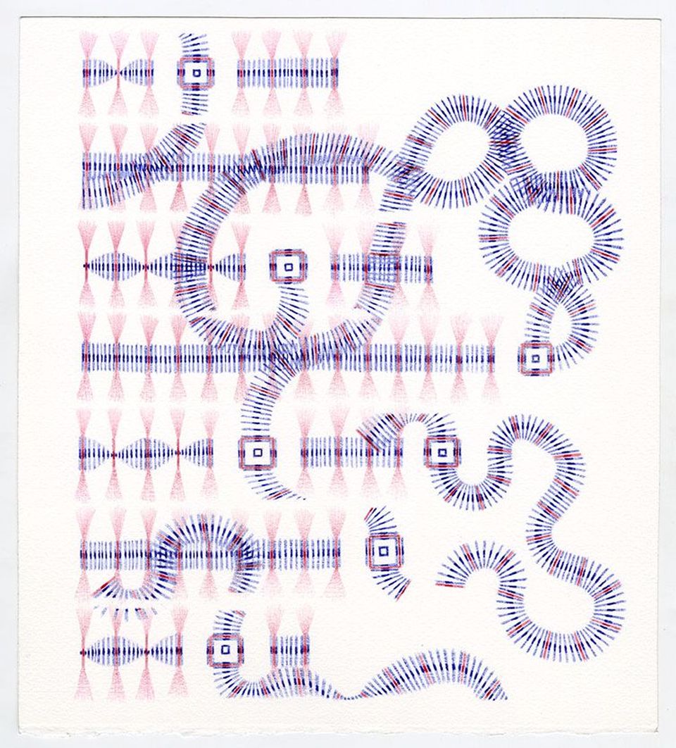
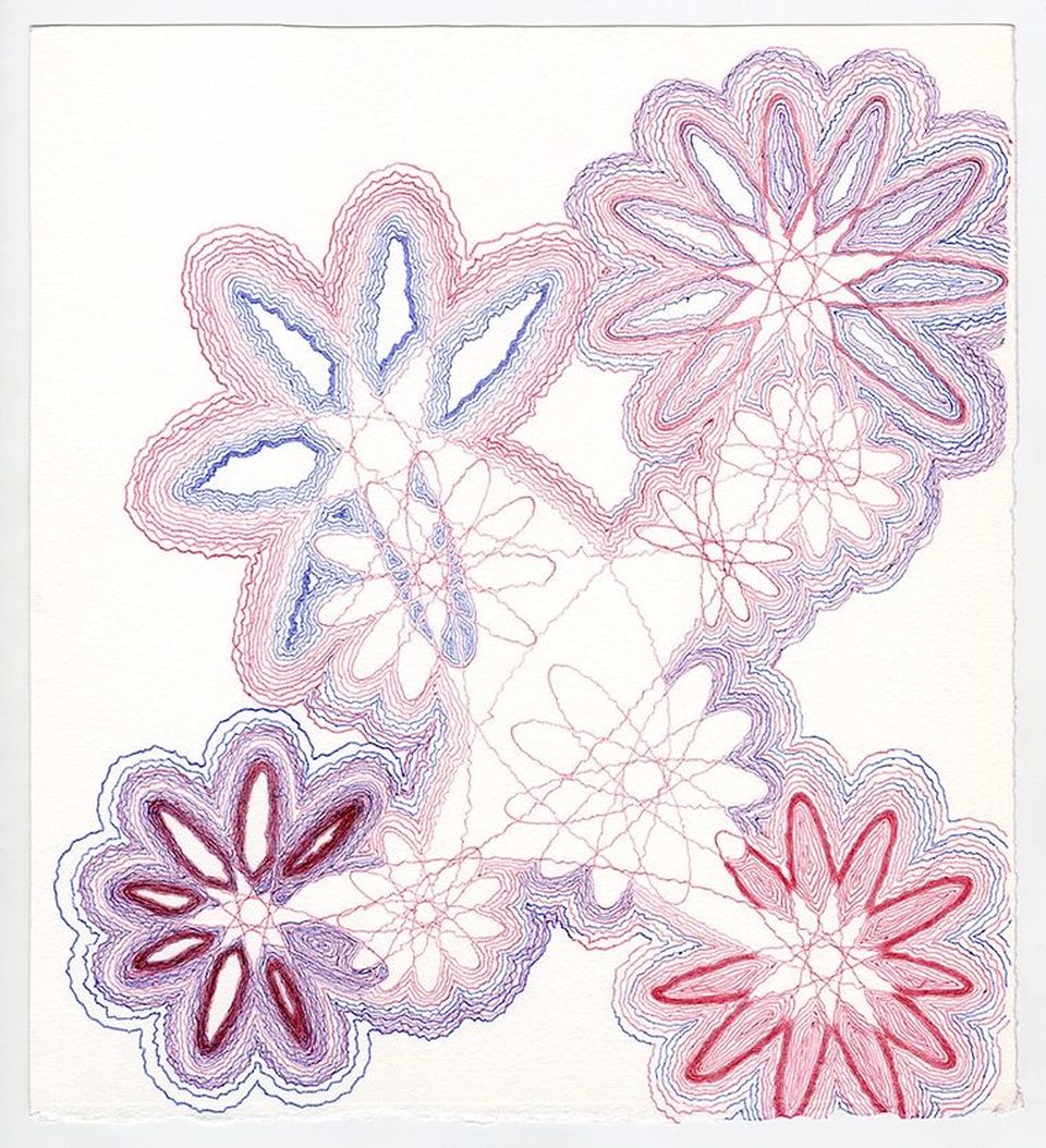
CA: I find inspiration in physics, mathematics, biology, nature, games, patterns, clothing, technology, architecture, etc. Because I start with just a mark and a rule for repetition, I need minimal information to get started. So the work is less physics-based than systems based, by which I mean a system of logic. You refer to one aspect of some of my works that I find very satisfying. What happens in this case is a rule will initially produce a sharp geometric pattern, but the pattern will shift toward a softer organic one as a result of either much repetition, the inability of my hand to stay sharp, or even the intentional loosening of a rule.
I think of these works as akin to mini physics calculations or simulations. As a student of theoretical physics, one often fine tunes previous calculations by adding complicating factors that apply in certain cases. The really creative physicists (even students) may introduce a whole new approach to solving problems. I never got that far and probably never would. I wanted to be creative in physics, but it wasn't my natural language - it was too strict - although I loved learning about fundamental mysteries of nature. And even an average grad student in physics is struck at times by epiphanies when something bewildering suddenly rings clear. In my drawings, I start from scratch, or first principles as we say in physics, like a physicist who is applying a new approach to a problem. I have a hunch as to what will happen, but I am often surprised at how different the result ends up.
AC: Your art draws viewers in, either leading the eye throughout the piece or trapping them in an illusion. Do you plan out your drawings beforehand or let the piece take shape as you go?
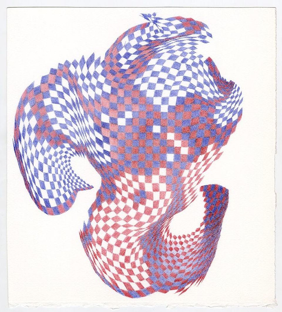
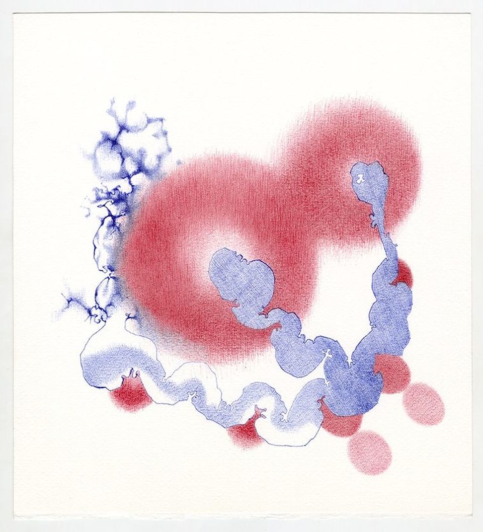
CA: I always have a plan, a very simple plan: one mark and one rule for how to repeat it. For example, Untitled (2016-12-001) started with a red square somewhere in the middle of the paper. The rule for repetition was that the that the next mark had to be red, four sided, and touch the corners of the first, but it's internal angles could change turning it into a parallelogram. This was the first rule, and it never needed to be changed. The pattern resulted in a wavy checkerboard. At the time, I had starting working with two colors to see the effects of placing one right next to the other.
So I introduced a second mark that was a blue four sided shape that had to fully touch all of the red marks around it, e.g. it filled in the white areas of the red checkerboard wherever it extended to. However, when they reached the edge of where the red marks were, they could extend beyond the boundary in the same way the red marks had colonized a region.
That was the extent of the rules. There was free will to continue making marks as long as the rules were adhered to. Eventually I noticed that the squares were not all the same saturation of hue, so I explored that a little. The final shape was not planned. The illusion you refer to is an accident of the process, but it can be manipulated within the rules.
AC: Most of your recent work is in red or blue ink. Is this because of the medium (ballpoint pen) or are you exploring a juxtaposition between the two colors?
CA: About ten years ago I made work in the full spectrum of colors, but I found that every time I used colors, the drawing would come out looking like a rainbow. I couldn't seem to stick to a particular palette range. I decided that I really didn't understand the interaction of color beyond the very basics. And I find color very daunting. So in the fall of 2010 I decided to restrict my work to black pen only. The reason I use ballpoint pen is simple - its portable, and it reminds me of solving physics problems.
I commute an hour to and from work each day. I used to keep a sketch book, but it seemed such a waste that those works would never be seen. So I cut up some large paper such that it would fit in a thin cardboard box used to ship LPs which in turn fit into my backpack. All I needed to do was develop the courage to make work in front of total strangers on the subway. It was easier than I imagined. And even though I sometimes worried that someone would make a comment when I was screwing up a drawing, I realized that people couldn't tell.
In the fall of 2015 I got bored, and decided I needed a change. I was ready to graduate to two colors. Because black produces the greatest subtlety, I decided to use the two next most available ballpoint pen colors: red and blue. They have different qualities, but I knew that would be true of any pair.
AC: What are you currently working on? Where can we see your work?
CA: The red and blue drawing have advanced to the stage of great saturation. Previously I was interested in drawing only on the top of the paper's tooth, so that the structure of the paper itself is revealed. I still find it somewhat mystifying that by covering something with an object, you an actually see it better. It's like a lens. Put it between you and the object you're interested in and instead of seeing less of it, you actually more detail. It may seem simple and obvious, but imagine if you'd never before seen glass or a transparent/translucent material. And this happens with ink too. There is a naturally occurring cloudy white stone called ulexite which when placed on a book makes the text look like its hovering just under the surface of the stone's face. It's quite surprising.
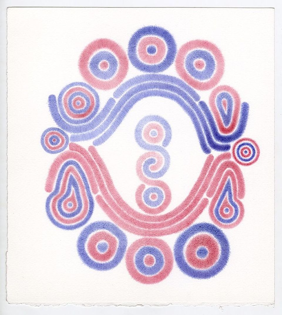
For years my drawings were like gravestone rubbings. Recently I noticed that red and blue placed right next to each other in small enough bits are read by the eye as purple, but a purple that is much brighter than if you had covered a red layer of ink with a blue layer or vice versa. I guess this is one of the Impressionists' discoveries that I never quite appreciated. Now I'm eliminating most of the white areas of the paper to see how intense the purple can be next to pure red and blue. Its such a simple and basic exploration.
Of course I'm making larger drawings too which take much more time time to complete. They're often inspired by a smaller drawing which seems to have a lot more potential, but the results never turn out like the small ones. I'll be showing some work this summer at the Bridges Conference up in Montreal in July. The magazine Physics Today will include a drawing to accompany an article called "Hidden worlds of fundamental particles."
Drawings were also included in the following publications, which I believe are still available:
- Devouring the Green, poetry anthology, ed. Sam Witt, Jaded Ibis Press, Seattle, WA, 2015.
- Emanations: 2 + 2 = 5, p. 477 and back page, .ed. Carter Kaplan, International Authors, Brookline, MA, 2015.
- Don’t Go Back to Sleep, cover and 4 images, poems by Timothy Liu, Saturnalia Books, Ardmore, PA, 2014.
- For Dust Thou Art, 3 images, poems by Timothy Liu, Southern Illinois University Press, Carbondale, IL, 2005.
My work can also be seen online in the following locations:
www.chrisarabadjis.com
facebook.com/arabadjis
instagram.com/carabadj
www.chrisarabadjis.com
facebook.com/arabadjis
instagram.com/carabadj

